Material Design is a set of rules defined by Google to build a graphical interface. It was first introduce in June 25, 2014, at the Google I/O conference, and is used since Android 5.0.
The goal of Material Design was to build a unified interface and experience across platforms and device sizes. It was built upon a list of principles that I won’t detail here (because that’s not the point of this post), but I can a least give you a summary :
- Material is the metaphor : each element exists in space, and follow the rules of physics. The background of your application is one giant big sheet of paper, with components lying on top of each other that can rearranged.
- Bold, graphic, intentional : typography, grids, space, scale and colors create a hierarchy of elements with meaning, and focus
- Motion provides meaning : motions must be used to focus attention on elements, without breaking the continuity. Transitions are efficient, coherent, and feedback is subtle, yet clear.
Using these guidelines, Material Design applications tend to be somehow minimalistic. This is a good opportunity for us to build a wallpaper, as we won’t need much knowledge of the advanced features of Gimp.
So let’s dive right into it !
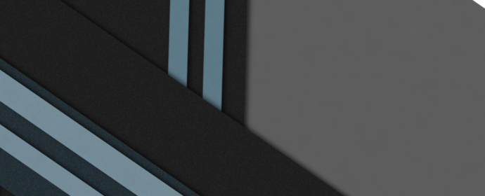
But what does Material Design wallpapers looks like? Well, you’ve seen one as the banner of this post, and if you are using an Android device, you’ve probably seen some too.
I’m not a very advanced Gimp user, nor am I very talented with
design or artistic creations. But anyway, this is my very first wallpaper I made for this blog.
The goal is of course to use it on your smartphone, not as a desktop wallpaper.
Here are some other samples from the web


I do not own any of these pictures, I just found them on http://www.topofandroid.com/
Let’s now learn how we can achieve something similar.
Starting with GIMP
On Ubuntu, GIMP should be installed by default, but if that’s not the case, let’s do it now :
On Windows and OSX, you can download GIMP here : https://www.gimp.org/downloads/
Once started, the very first configuration you should do is switch to the “Single Window” mode (at least on Ubuntu, otherwise GIMP will use separate windows for all elements, and that’s definitively not user friendly at all).
The next step will be to rearrange the menus a bit. You can drag and drop any tabs from a menu to move it somewhere else. This is the layout I’m using right now :
- On the top left, all the tools are listed. This is similar to Photoshop (even if the tools are different)
- On the bottom left, the selected tool options are listed
- On the top right, I kept the default layout, but I decided to move the “Layers” tab in the bottom right corner.
Installing the Material Palette
A palette is simply a predefined set of colors. In this case, someone was kind enough to create one with all the recommended colors when working with Material Design. Simply head to https://github.com/KiSSFLOW/gimp-material-design-color-palette and download Material-Design.gpl somewhere on your computer.
Then in Gimp :
- Go to Windows > Dockable Dialogs > Palettes.
- Once opened, click on configure this tab on the top right corner of the new window, and select Palettes Menu > Import Palette
- Select the option “Palette file” and browse to the downloaded file
- The palette should now be listed in the window. Double click on it to open the list of colors
Creating a new file
To open a new file, simply go to File > New. In this case, I decided to create a 1080 x 1920 (portrait) picture. There are a lot of mobile resolutions, so I decided to take something big enough to support
all devices. This won’t matter much in our case, as our wallpaper is mostly made of resizable shapes.
Leave everything else to the default value (ensure px is the default unit) and click Ok.
Before actually working on the wallpaper, let’s think a bit about what we want. If you have read the Material Design article, you may have found some parts explaining the similitude with paper sheets. This is exactly what we want to do. Put abstract shapes on top of each others, add some shadows, and finally some texture to the shape.
Creating a base
The very first step will be to choose a background color. In this case, I’m trying to create a green background, so I’ll pick the darkest green from the palette.
Use the Bucket Fill Tool (shortcut SHIFT + B) to fill
the whole background.


Now, one very important step. Each time we want to add a new shape, we first need to create a new layer. Just think of sheet of papers. Each sheet is a new layer. So let’s create a new layer (you can name it if you want,
it will be easier to keep all layers organized if they have a proper name)
Next we will add our first shape on top. So let’s start with the Rectangle Tool (shortcut : R)
Draw any shape you want, then, pick a color from the palette, and click in your shape using the Bucket Fill Tool again. In this case, I choose a lighter green.
Now, using the Scale (SHIFT + T) And Rotate (SHIFT + R) tools  , let’s rotate our shape by
 45° and scale it (if needed).
Finally, you can move the shape using the Move Tool (M)

Click on the anchor to merge this floating selection with the previously created layer.
Now, let’s add some shadow to this first shape. Ensure the shape layer is selected. Go to Filters > Light and Shadow > Drop Shadow. Keep the default settings but deselect “Allow resizing” (offset X and Y = 4, blur = 15, color = black, opacity = 60).
Once this is done, Right Click on the first layer (either your shape or the drop shadow), and select merge down.
This will ensure both the shape and the shadows are one element (both will move together, etc.)
Let’s repeat the same operation with two new shapes. Start with a new layer (each time), then reuse the sames tools as before : Rectangle Tool, Scaling and Resizing tools, Moving Tool, and then anchor
the floating selection to the layer.
Then, apply the Drop Shadow (note that a shortcut will be added in the Filters menu, so you can reapply the previous effect with the same settings). Don’t forget to also Merge Down the shape and its shadow.

Adding complexity
To improve our wallpaper, let’s add more shapes and some new colors. Let’s pick the left shape layer, and duplicate it.
Using the Bucket Fill Tool, pick a lighter green, and click on your shape. Then, move it to the left.
Repeat the operating and duplicate the shape, using a different shade of green each time. Try to add some contrast too.


If the shadow is too dark, because two layers are overlapping, simply use the Eraser Tool* (
SHIFT + E), select
the lower layer that overlaps, and erase the shadow with the eraser.
# Adding more complexity…
By varying the shapes and colors, you should really start to have something nice. Here are the steps I did. Feel free to copy them, or do something very different.
Randomness is also very important.


I wanted to add some triangles too. So, using the Free Select Tool, I created a triangle (click once for each vertex), and filled it with another shade of green. Then I duplicated the shape (and its shadow), and picked once again
another green.


I didn’t really liked the green I choose as contrast, so I went for yellow instead by simply selecting the Bucket Fill Tool, then each layer, and clicking on the surface to repaint.


Final adjustments
To experiment a bit more, I decided to add a gray circle to the wallpaper. First, let’s create another new layer. Then, using the Ellipse Select Tool, draw a perfect circle by holding the SHIFT key to keep the 1:1 ratio
and fill it with gray.

Just above the layers, adjust the opacity to 50, and switch the (blending) mode to Hard Light
Create once again a new layer, a new circle, but this time, fill it with white.
Set the opacity to 25 and the mode to Overlay
I like what we have so far, but I want to give it a more “physical” feel, by adding some texture to the shapes (to mimic real paper).
To do that, select a layer and simply go to Filters > Noise > RGB Noise and use these
settings

I reapplied the same operation (you can hit CTRL + F to
reapply the last filter on the select layer) on all green shapes (not the yellow ones).
The change is very subtle though.
Saving your creation is easy (File > Save As…), but if you want to save it as a .png file, just go to File > Export As… instead.
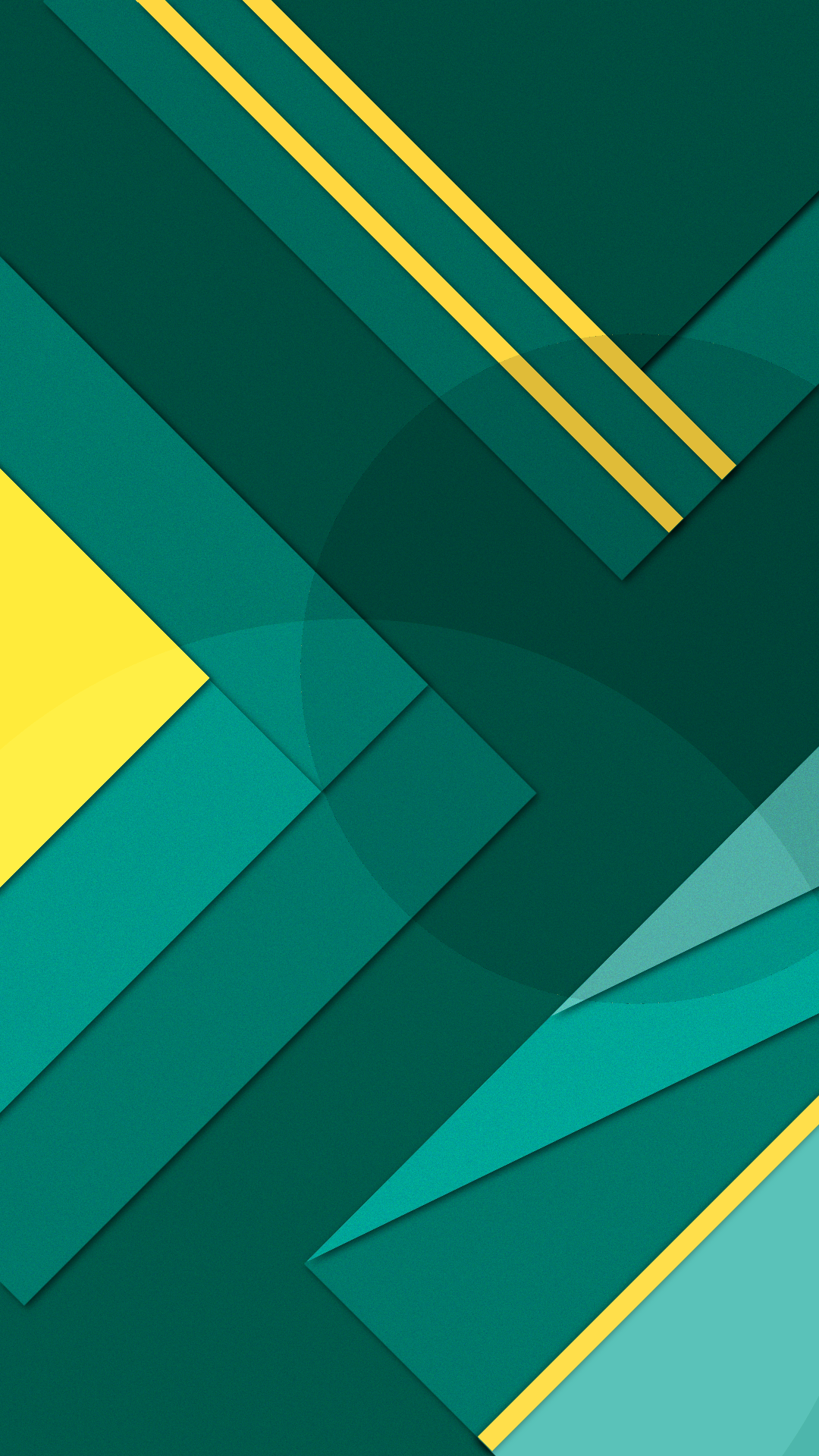
The final result can be seen here (feel free to use it !) : Download
Tips and tricks
If you want to easily change all colors, follow these steps :
- Hit
CTRL + Ato select the whole canvas - Hit
CTRL + SHIFT + Cto copy all layers as one single merged layer - Hit
CTRL + SHIFT + Vto copy into a new composition/tab
Go to Colors > Colorize, and play with the Hue. You can use another color for your lock screen, or simply lower the Saturation


Conclusion
This was a big post, and I hope you were able to follow along. If not, don’t hesitate to ask questions in the comments below (you need a (Disqus)[https://disqus.com/] account,
but you can create one directly by using your Google, Twitter of Facebook account).
I also hope that you have learned a bit more how to use Gimp. Feel free to try the same things in
any other software of your choice (Photoshop for example). You can also share your own creations if you want.
Note : You can use the final wallpapers whenever and wherever you want.

